Transforming Your eCommerce Store Navigation Into a Conversion-Boosting Machine
If you want to successfully sell a product online, you must cultivate a rich and seamless shopping experience to stand out from the crowd. Core to creating this experience is robust information architecture (IA), which is like the backbone of an eCommerce website, supporting user-friendly navigation and ensuring optimal site performance.
Read on to save your customers from potential navigation frustrations with information architecture. ⬇️
Why You Should Care About Navigation & Information Architecture
The primary job of a good IA is to create a positive and frictionless user experience (UX) by placing content on an eCommerce website exactly where users expect it. Your customers want to find what they are looking for within a few clicks.
The first question you should be asking yourself at this point is how do I know where people expect things to be on my website?
This is when we need to start talking about mental models and recognition patterns.
Mental models
It all starts in our heads. In order to understand everything that surrounds us, we create mental models, which are our own personal vision of the world. When we encounter something new, like a new item or place, these models kick in and tell us what we’re supposed to do and how we’re supposed to behave.
Mental models are a sum of our experiences that tell us how to approach newly encountered problems or situations. Watch this short clip from our latest webinar to get a better understanding of what mental models are and how they apply in eCommerce.
Recognition patterns
Recognition patterns in the context of eCommerce are the recurring behaviours or habits exhibited by customers when they interact with an online shopping platform. These behaviours can manifest in various ways, and identifying them can provide valuable insights for your business.
Mental models and recognition patterns are responsible for how customers browse an online store. Do they go straight for the search bar, or do they try to find the product browsing through categories? Or maybe they prefer scrolling through recommended products?
Analysis of these patterns is the foundation to designing a shopping experience that allows customers to navigate in accordance with their needs and expectations. This is what information architecture is.
Takeaway: it’s not enough to organise your website structure in a way that you think is best for customers, even if the structure you come up with is based on logic. Users will have a picture in their head of how your store is supposed to look and navigate even before entering your website.
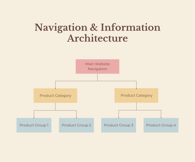
Designing Information Architecture For Your Website
Designing your IA to ensure smooth navigation for customers should be based on two principles. The first one we already touched upon – organising categories in a predictable way and placing them in accordance to user expectations. The second principle is equally important and it’s about reducing cognitive load.
User research
These days everybody knows about the importance of buyer personas, but when it comes to IA and navigation, we need to go much deeper than audience demographics and the products they are looking for.
You need to understand not only who your customers are, but what they are expecting from your website and how they navigate through it.
This information is often the only way to organise your website architecture to match the behaviour and movement of your customers with the goal of getting them seamlessly to the product they are looking for.
In order to find out how users behave when they enter your website you need to conduct meaningful user research. Here’s a few effective ways to do it.
- Recruit members of the target audience
The idea is to get a representative sample of users who can provide valuable insights into how real customers interact with your website. While this sounds fairly complex, you only need 5 users for this research to discover most of the major usability issues. A study conducted by Jakob Nieles showed that when adding more than 5 users, you learn less and less because they keep reporting the same issues.*
- Card sorting sessions
This is a great exercise that helps create product categories where the participants are asked to place cards with product images and descriptions into categories in a way that they think is logical. They are then asked to name these categories.
A closed variation of this exercise may include grouping product images and description into predefined categories.
- Tree testing sessions
During these sessions, participants are asked to find certain products on a website. They begin navigation through the website and indicate where they would expect to find the products. This is great for discovering how quickly users can find what they are looking for on your website and the route they took to get there.
www.optimalworkshop.com has tons of useful UX exercises like the above, I highly recommend checking it out.
Cognitive load
Cognitive load is how much information users can take when interacting with your website without becoming overwhelmed. If customers are presented with too much information or too many required actions, you’re essentialy frying their brains.
One of the key goals of a good navigation & information architecture setup is to minimise cognitive load. This can be achieved by simplifying navigation, making information easy to find and guiding users through a seamless checkout process.
Here are the key principles of how to use information architecture to minimise cognitive load.
- Simplicity: The website should be easy to navigate with clear categories and a straightforward checkout process.
- Consistency: Consistent design elements, navigational structures, and terminology across the site help users predict where they can find information.
- Searchability: A search function and filters that show the users products that they are actually looking for.
- Scalability: The website design should allow for the addition of new products or categories without disrupting the existing structure.
Image source: unsplash.com
Another important principle is optimising the number of options. Presenting users with too many options will often lead to decision paralysis, where customers find it difficult to make a purchase decision and usually end up abandoning your website.
Even if you have thousands of products in your catalogue, a single user will only need a few at a time, so you don’t want to present every user with every possible product.
This amount of cognitive load is guaranteed to deter a customer from making a purchase.
To avoid this, it’s important to group similar items together (keeping in mind where users expect to find them) and ensure effective and accurate filters to help easily narrow down possible choices. We’ll talk about how to effectively use filters in more detail in another article, so keep your eyes peeled for that.
Takeaway: Conduct user research to discover what your customers expect from your website and how they navigate through it. Recruit members of your target audience and use exercises like card sorting and tree testing to establish how to categorise your products and navigation paths.
Reduce cognitive load by optimising the number of choices customers are presented with. Some of the best ways to reduce cognitive load are accurate search function and effective filters.
User-Centric Navigation Strategy And Design
Once a desirable information architecture is established, it’s crucial to ensure that users can navigate it easily and access information instantly.
Focused navigation systems
Navigation design should stem from information architecture design, not be conceived in isolation. Because customers have varying preferences for finding products, your navigation strategy should include diverse mechanisms to provide various access to products.
A good navigation strategy should include several navigation mechanisms that provide access to the content in different ways.**
Your website navigation menu shouldn’t be limited to just one type of a label (i.e. by product type) or a single way of navigating through it (i.e. through the main navigation interface). This is because different users prefer different ways to find the products they are looking for.
Here are some types of navigation that most eCommerce stores should have.
- Topic navigation: The main topic areas your customers are looking for that reflect your buyer personas.
- Timely navigation: A shortcut that takes customers to subtopics that are especially relevant, seasonal or promotional.
- Signpost navigation: Providing the user with clear and concise cues about where they are and where they can go next.
- Breadcrumb navigation: These are a form of secondary navigation that reveal the user’s location in a website’s hierarchy. They’re particularly useful in eCommerce sites with multiple layers of categorisation.
- Search bars and filters: These allow users to navigate the site in a more targeted way by seeking out specific items or categories.
- Pagination: Dividing your content into separate pages, for example limiting how many products per page can be displayed. This can improve load times and give users the sense control, allowing them to navigate forwards or backwards.
Combined navigation mechanisms done right
Let’s look at an example of how to use combined navigation mechanisms on an eCommerce website.
Sportstsdirect’s homepage offers multiple ways to start a product search, effectively combining multiple search mechanisms:
- the search bar
- the main navigation menu
- The timely navigation shortcuts underneath the main navigation menu that take users to topical categories
 Image source: sportsdirect.com
The main navigation menu, while big, offers clear insight into categories based not only on product types but also on brands, purpose, buyer’s interests, and more.
 Image source: sportsdirect.com
The search bar offers predefined suggestions to reduce cognitive load. If users initiate a product search and get overwhelmed by the many possible options, these categories guide them, helping them navigate to other areas of the website.
 Image source: sportsdirect.com
Once users land on a product page, they encounter the classic breadcrumbs navigation in the top-left corner. This navigation tool assists them in understanding their current position in the website hierarchy and enables them to search for products similar to the one they are viewing.
Takeaway: Navigation design must evolve from the information architecture, not exist in isolation.
Considering that each customer will have their unique preferences for product discovery, it’s crucial to design a navigation strategy that’s versatile. Your strategy should include a variety of mechanisms that offer different ways to access content, catering to diverse customer needs.
The Benefits of Optimising Navigation and Information Architecture
Getting navigation & information architecture done right is crucial for an eCommerce store and brings a lot of benefits.
✅ In a nutshell, a user-friendly experience brings higher satisfaction, increased engagement, and improved customer loyalty to your eCommerce store.
- Improved conversion rates
Optimised navigation paths pave the way for higher conversion rates. When users can navigate smoothly from product discovery to the final checkout, friction is reduced, and the likelihood of completing desired actions, such as making purchases, significantly increases.
✅ Easy-to-navigate interfaces remove barriers and simplify the user journey, ultimately resulting in increased sales, revenue, and business growth.
- Increased customer retention
User-friendly navigation and well-organised IA are vital for positive user experiences. If customers can find what they need easily and enjoy a seamless shopping journey, they’re likely to return for future purchases and become loyal customers.
✅ When you prioritise improved navigation, you can build customer loyalty, leading to long-term success and sustained revenue for your eCommerce business.
- Better search engine visibility
Optimising navigation and IA not only benefits users but also enhances your website’s visibility to search engines.
Clear menus, strategic internal linking, and relevant categorisation enhance your website’s structure and organisation.
✅ This, in turn, enhances search engine crawlability and indexing, ultimately leading to higher search engine rankings. Higher rankings mean increased organic visibility, attracting more traffic and potential customers to your online store.
- Enhanced mobile experience
Optimising navigation and IA for mobile devices ensures seamless browsing and navigation on smartphones and tablets.
✅ Mobile-friendly designs, touch-friendly elements, and simplified menus create a frictionless experience for users on the go. A positive mobile experience translates into higher mobile conversions and increased customer satisfaction.
- Cross-selling and upselling
Well-planned navigation structures allow for strategic placement of related products and recommendations. If you’re able to redirect users towards complementary items through intuitive navigation, you can increase cross-selling and upselling opportunities.
✅ Effective product recommendations and cross-selling techniques boost the average order value and overall revenue for your eCommerce store.
- Streamlined inventory management
Organised product catalogues and navigation structures facilitate efficient inventory management. Clear categorisation, accurate product attributes, and effective filtering options streamline inventory processes, enabling you to manage your inventory with ease.
✅ Optimised navigation not only benefits your customers but also aids in inventory management, reducing errors and improving operational efficiency.
💡 Ready to take your eCommerce game to the next level? Get in touch and we’ll help you learn the secrets of mastering your website navigation & information architecture.